

How to Change the Banner Layout of a Trip
Change how the photo area at the top of your trip pages looks, with seven ready-made layouts to choose from in WP Travel Engine.
What the banner does
The banner is the image area at the top of each trip page. It is the first thing travelers see when they open a trip. WP Travel Engine gives you seven banner layouts, so you can choose how your trip photos appear.
You'll need WP Travel Engine installed and activated on your WordPress site before you start.
How to get to the banner settings
You will use the left-hand menu in your WordPress dashboard to find the banner settings.
Log in to your WordPress dashboard
Log in to your WordPress dashboard. This is the admin area where you manage your website. You can usually find it at yourdomain.com/wp-admin.
Open WP Travel Engine
In the left-hand menu, click WP Travel Engine.
Open the settings
Click Settings in the submenu that appears.
Open the Display tab
At the top of the settings page, click the Display tab.
Open the Single Trip settings
Click Single Trip in the row of sub-tabs underneath.
Find the Banner Layouts section
Look for the section labeled Banner Layouts. This is where you pick how the top of your trip page looks.
Choose and save your layout
Choose any layout you like. Scroll down and click Save Changes to apply it.
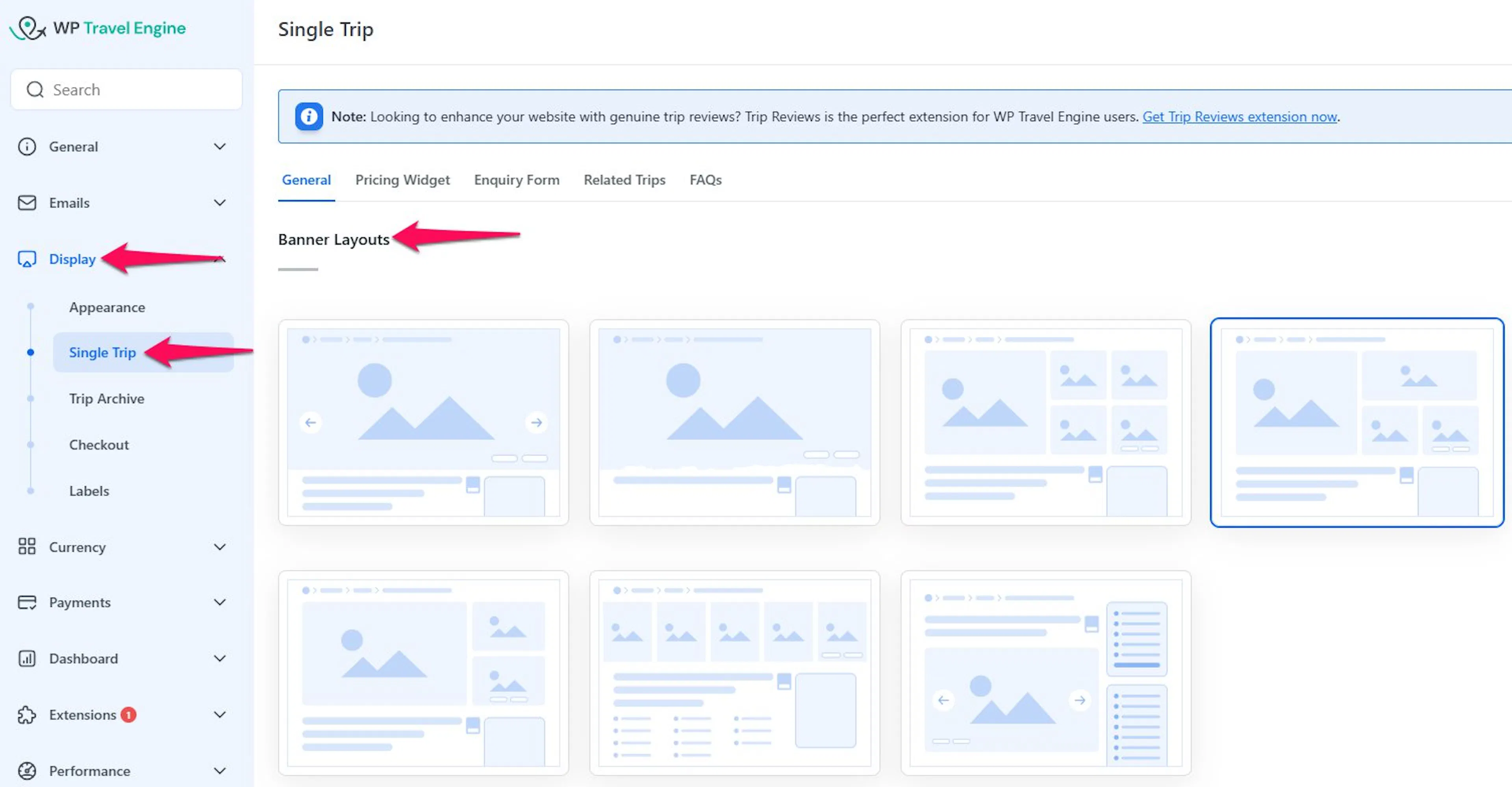
Now let's look at what each layout looks like, so you can pick the one that suits your trips.
The seven banner layouts
Each layout arranges your trip photos differently. Here's what each one looks like and when it works well.
Layout 1: Full-width image slider
A wide image slider stretches across the full width of the page. A slider is a row of photos that changes when you click the arrows on the sides.
Travelers can browse through your photos using the arrows. A Gallery button appears in the bottom-right corner. When someone clicks it, all your images open in a lightbox. A lightbox is a pop-up overlay that shows the full-size image over the page.
Say you've got stunning photos of a Himalayan trek. This layout puts them front and center, so travelers see them when they land on your trip page.
For the best display, use images that are 1920 x 800 pixels.
Layout 2: Original image with optional full width
This layout shows your image at its original size. If you want the image to stretch across the full width of the page, turn on the Display Fullwidth option for this layout.
First, view the setting that controls the full-width display.
Here is how the layout looks without full width.
Here is how it looks with Display Fullwidth turned on.
Layout 3: Split-screen with image grid
The left side shows one large featured image. The right side shows a grid of smaller supporting images.
The smaller images work well for showing different parts of your trip or different stops along the route. Think of a day tour with one main photo of the attraction and smaller photos of each stop along the way.
Layout 4: Split-screen with single image on right
This layout is similar to Layout 3. Instead of a grid of smaller images on the right, it shows one image at the top.
The simpler arrangement works well when you do not have many photos to show yet.
Layout 5: Large image with two supporting images
A large featured image appears on the left. Two smaller supporting images stack on the right.
This layout gives you one focused hero image with a couple of supporting shots. It can work well for a multi-day package where one photo shows the main experience and two others show the scenery or accommodation.
Layout 6: Five-image grid
Five images appear side by side in a fixed grid. When someone moves their mouse over an image, the image zooms in slightly.
This creates a subtle effect without requiring travelers to click anything. It can suit a seasonal tour with several activities to show at once.
Layout 7: Image slider below the trip title
An image slider appears below the trip title inside the main content area. The other layouts show the banner above the trip content.
This layout puts the photos inside the trip description. It is useful when you want the photos to feel like part of the description instead of a separate header.
One more thing is worth knowing before you pick your layout.
Good to know: banner layouts and mobile phones
Banner layouts are designed for desktop and tablet screens. On mobile phones, all layouts switch to a standard image slider. This keeps your trip page looking good and working well on smaller screens. You don't need to do anything extra for this. It happens automatically.
If you're still stuck or have a question we didn't cover, our support team is happy to help. Reach out at our support page and we'll get you sorted.