

Destination/Activities 1 Widget
Display your tour destinations, activities, or trip types as a grid of clickable boxes on any page built with Elementor, and customize their layout, content, and appearance to match your website.
Overview
Add a grid of clickable boxes to any page built with Elementor. Each box can show a destination, activity, or trip type from WP Travel Engine.
A widget is a building block that you drag onto a page in Elementor. This widget helps visitors find tours by choosing the type of tour they want to explore.
F2our homepage to show those five regions as clickable boxes. Each box can link visitors to all the tours in that region.
How to add the widget to your page
You need both Elementor and WP Travel Engine installed and turned on. The widget will not appear if either plugin is inactive.
Make sure both Elementor and WP Travel Engine are active before you begin.
Open your page in Elementor
From your WordPress dashboard, find Pages in the left sidebar. Hover over the page you want to edit. Then click Edit with Elementor.
Your page opens in the Elementor editor.
Search for the widget
Look at the Elementor panel on the left side of your screen. Use the search bar at the top to search for Destination.
Elementor shows the Destination/Activities 1 widget in the results.
Add the widget to your page
Drag the Destination/Activities 1 widget onto your page. Drop it where you want the destination, activity, or trip type boxes to appear.
The widget appears in the page preview.
Open the widget settings
The widget settings now appear in the panel on the left. Use the sections below to choose what to show and control how it looks.
Layout settings
Layout settings control how the boxes are arranged on your page.
- Column: Choose how many boxes appear side by side. If you pick 3, destinations show in rows of three. On phone screens, Elementor adjusts the layout automatically so everything stays readable.
- Gap: Set the space between the boxes. A bigger gap gives each box more breathing room. A smaller gap makes the boxes feel more connected.
- Layouts: Pick from three different layouts. Each layout changes how the boxes look. Try each one to see which fits your website.
For example, if you have six destinations and pick 3 columns, you get two rows of three boxes. This works well on a wide page. With 2 columns, you get three rows of two boxes, which can look better on a narrower page.
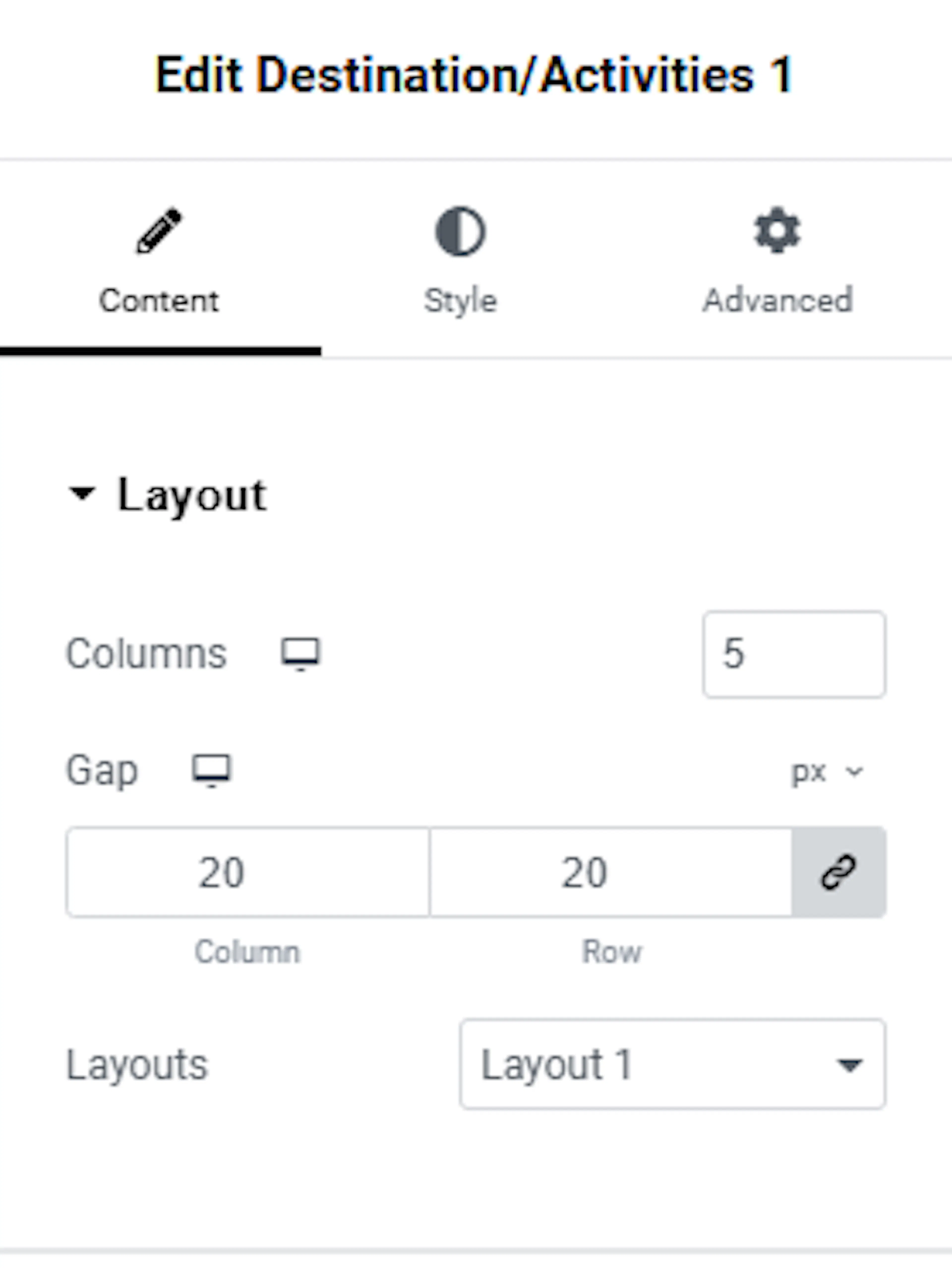
Choose the column count and layout that make your destinations easy to scan. Next, decide which destinations or other groups you want to show.
Choosing what to show
These settings decide which groups appear in the boxes. WordPress calls a way of grouping things a taxonomy. In WP Travel Engine, Destinations, Activities, and Trip Types are all taxonomies.
- Select Taxonomy: Choose whether to show Destinations, Activities, or Trip Types. If you pick Destinations, each box shows one of your destination pages, such as “Everest Region” or “Annapurna Region.”
- Show Term by: Decide how to choose which items appear. Default shows items automatically. Choose terms lets you select specific items from a list. This is useful when you only want to feature a few popular destinations.
- Number of Items: Choose how many boxes appear in total. If you have 20 destinations but only want to show 6 on your homepage, set this to 6.
Use these settings to keep the page focused. For example, feature your six most popular trekking areas on the homepage and show the complete list on a separate destinations page.
Extra options
These settings control the titles and trip counts shown in each box.
- Title Tag: Choose the heading level for the box titles. This helps search engines such as Google understand the titles on your page. H2 makes the titles more prominent. H4 makes them more subtle. If you are not sure which option to choose, leave the default setting.
- Show Trip Counts: Turn this on to show how many trips are linked to each destination or activity. For example, a box for “Everest Region” could show “12 trips” underneath the name. Visitors can see how much you offer before they click.
These options give visitors more context while they browse. You can now adjust the overall appearance of the widget.
Making it look good
These settings control the overall appearance of the widget.
- Background Color: Set the background color for the widget area. This is the space behind all the boxes.
- Padding: Adjust the space between the content inside each box and the box edges. More padding gives the content more room. Less padding makes the layout more compact.
- Border Radius: Control how round the box corners are. A higher number creates rounder corners. Zero creates sharp, square corners.
- Border Type: Choose whether to add a border around the widget area. You can choose a solid, dashed, or dotted border.
- Box Shadow: Add a shadow behind the boxes so they stand out from the page background. A light shadow can give the boxes a subtle three-dimensional effect.
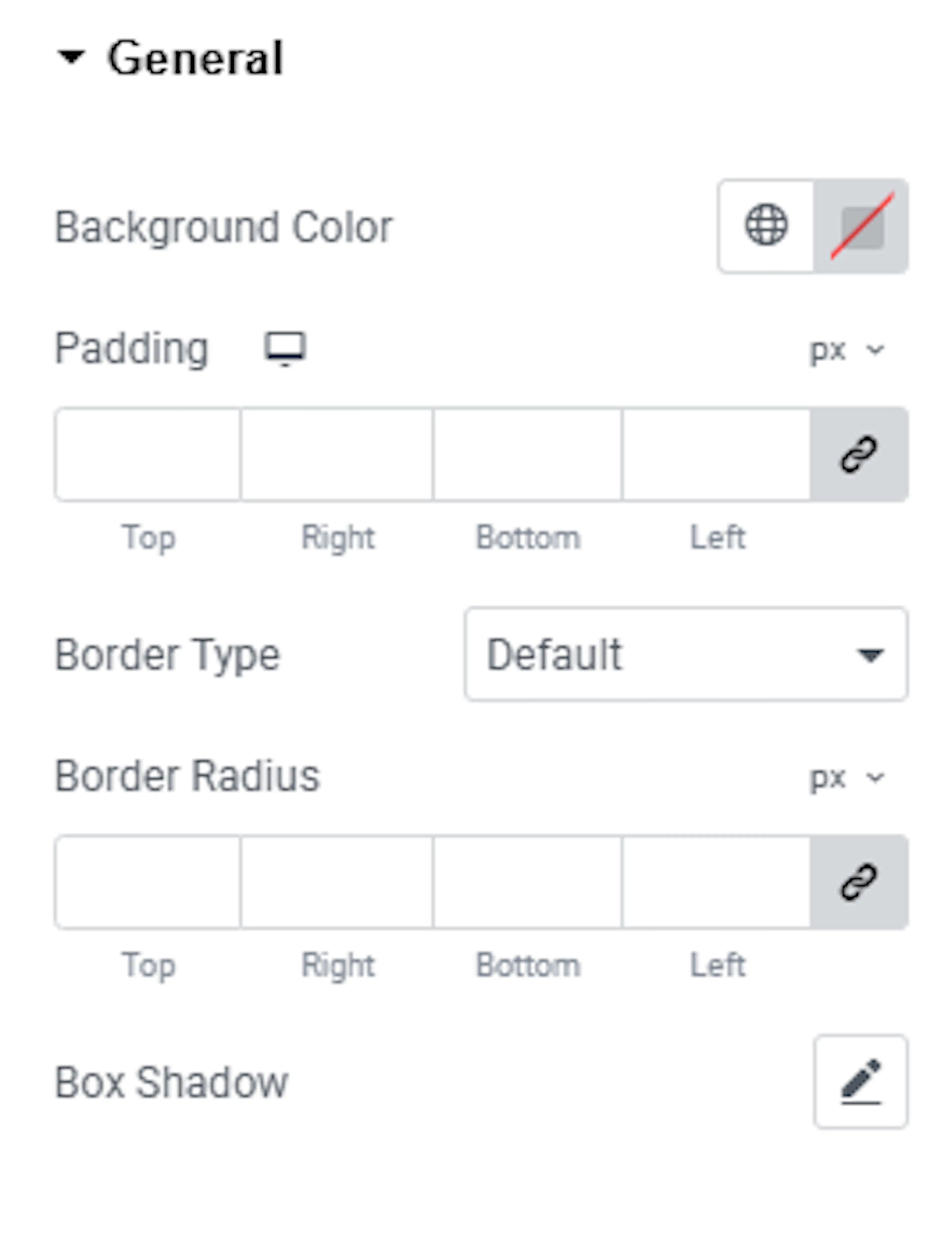
Each part inside the box can also be styled on its own. The sections below cover each one.
Content settings
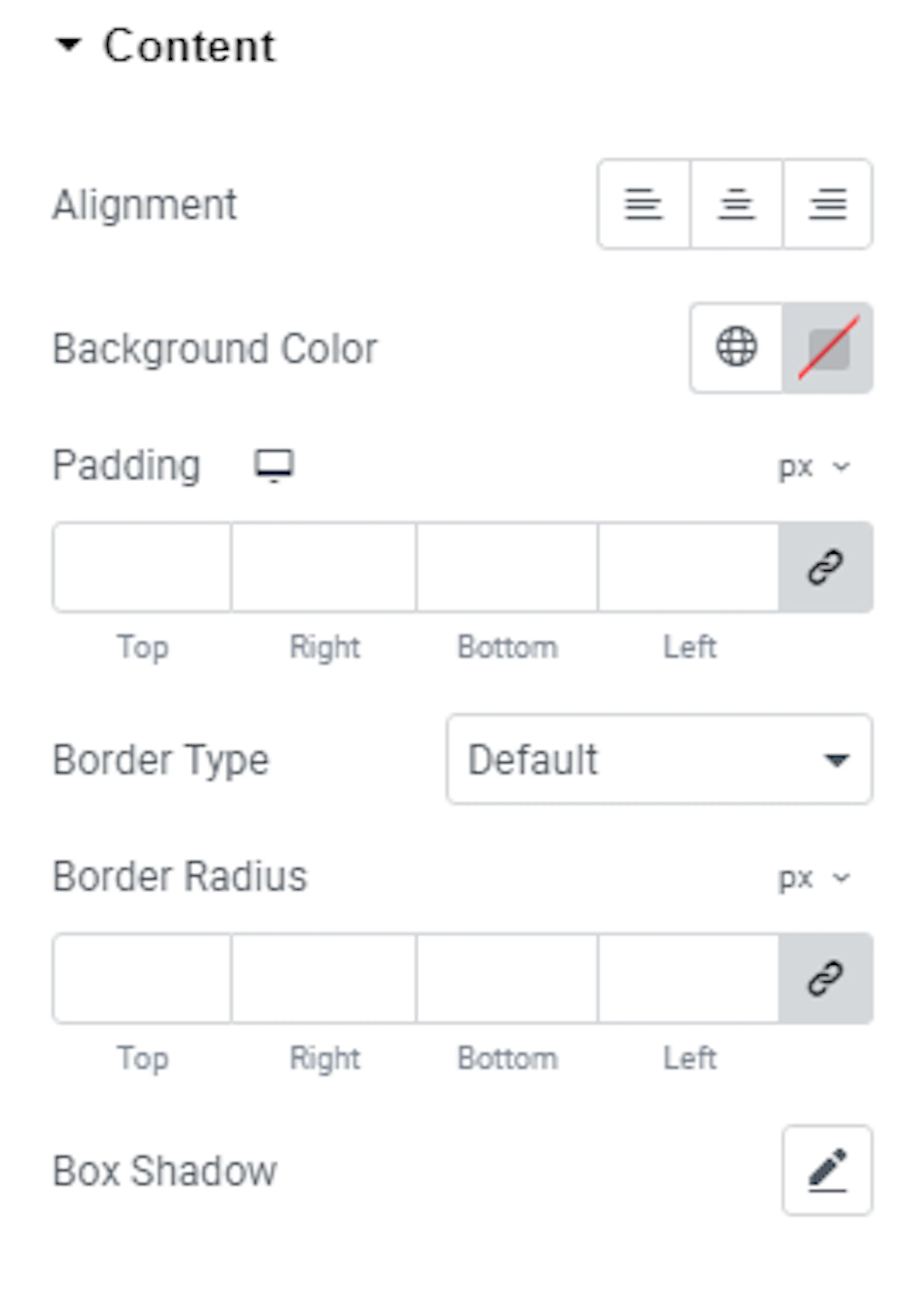
These settings control the inner area of each taxonomy box. This is the part where the image and title sit.
- Alignment: Line up the content to the left, center, or right within each box.
- Background Color: Set a background color for the inside of each box. This is different from the overall widget background above.
- Padding: Control the space between the box content and its edges.
- Border Type: Add a border around the inside of each box.
- Box Shadow: Add a shadow to each individual box.
- Border Radius: Round the corners of each individual box.
Title settings
These settings control how the name of each destination, activity, or trip type looks.
- Typography: Change the font, size, weight, and spacing of the title text.
- Color: Set the color of the title text. You can also set a different color when someone hovers their mouse over it. Hover means when a visitor moves their mouse pointer over the box without clicking. You can set a color for both the normal and hover states.
- Margin: Control the space around the title within the box. You can set this for both the normal and hover states.
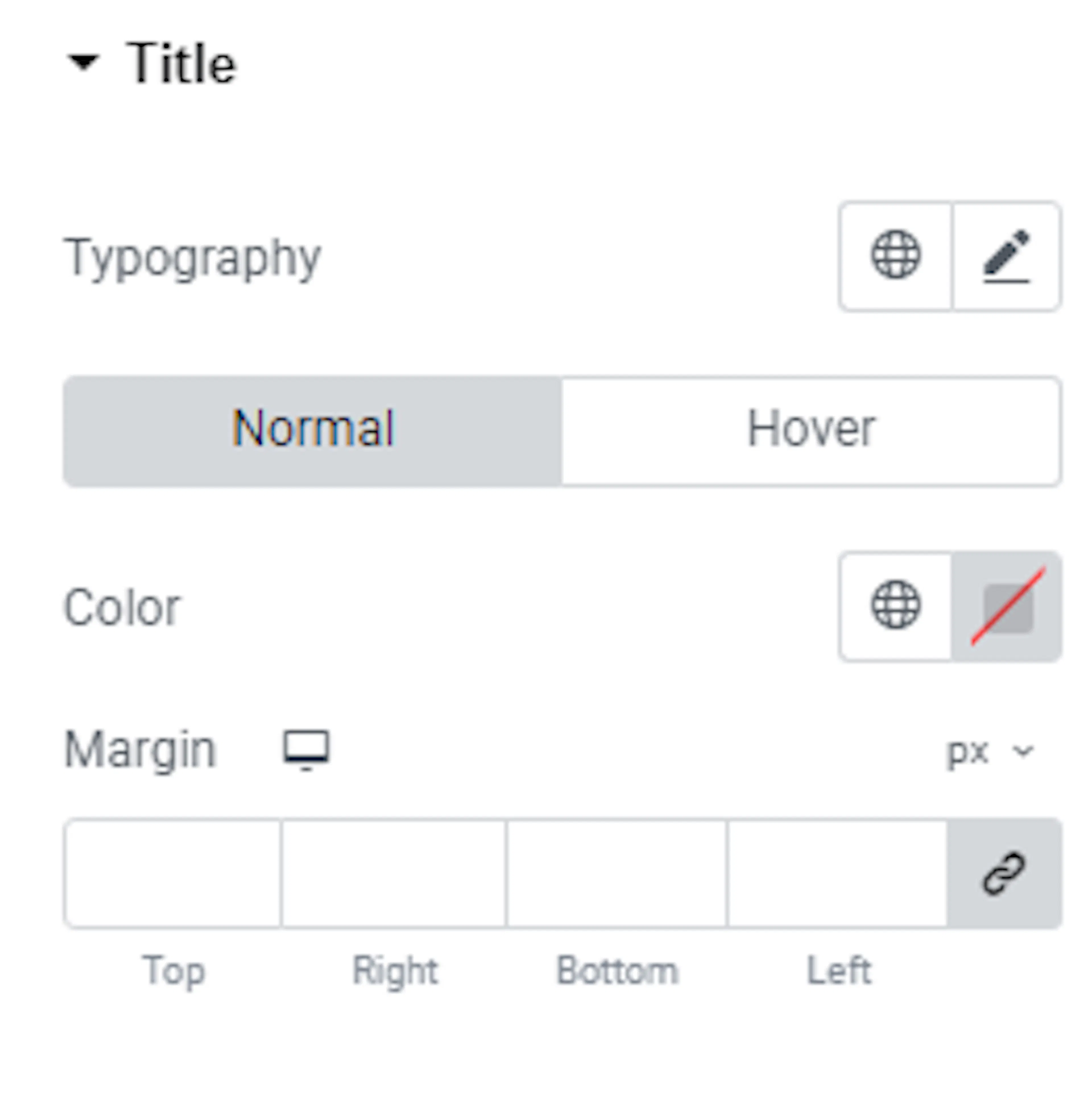
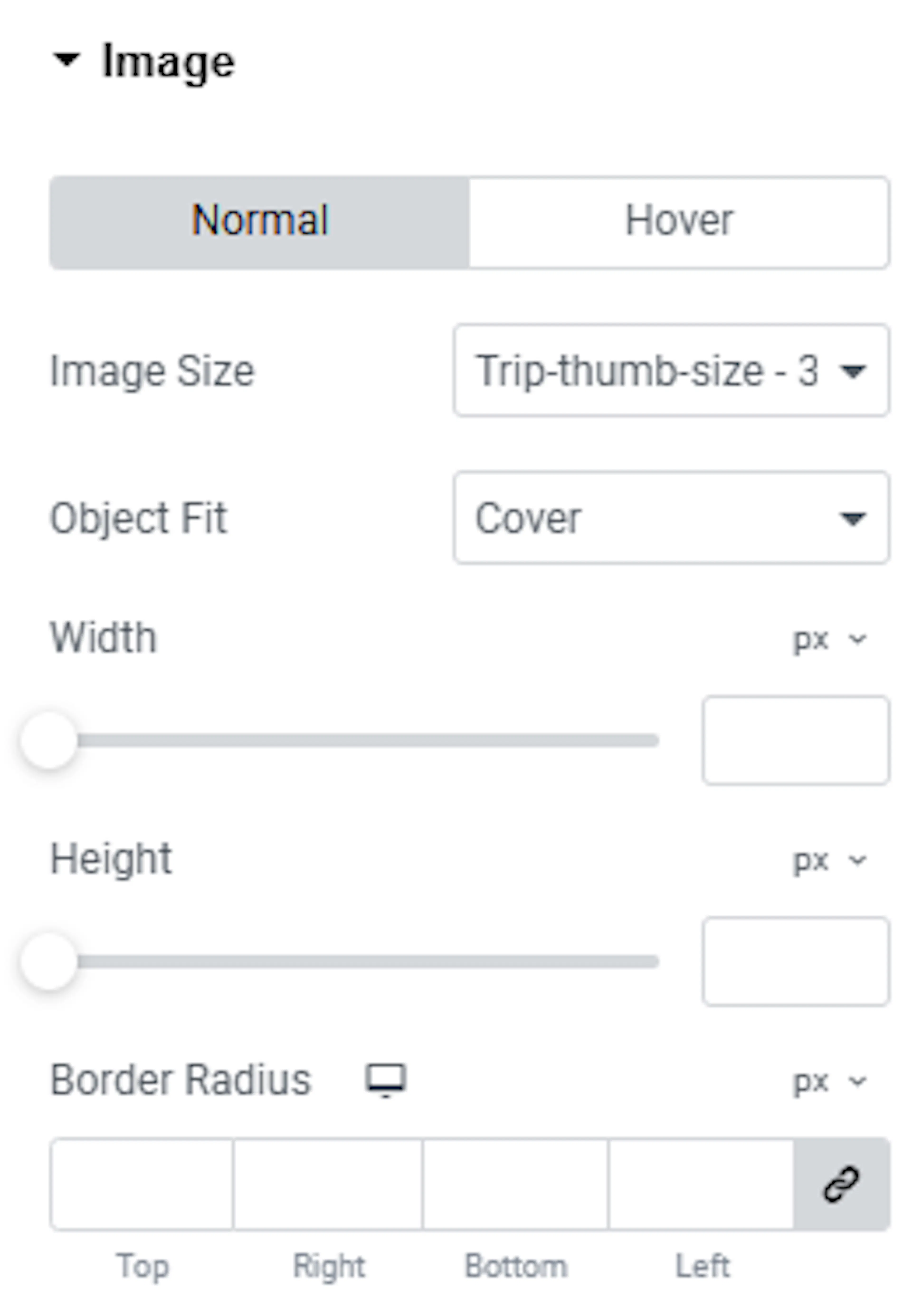
Image settings
These settings control how the photo in each box looks.
- Image Size: Choose the aspect ratio of the photo. This controls whether the image looks more square, wide, or tall. The setting is available for both normal and hover modes.
- Object Fit: Control how the photo fills its space. Cover fills the entire area but may crop part of the image. Contain shows the whole photo without cropping. The setting is available for both normal and hover modes.
- Width: Set how wide the photo appears in the box. The setting is available for both normal and hover modes.
- Height: Set how tall the photo appears in the box. The setting is available for both normal and hover modes.
- Border Radius: Round the corners of the photo itself. This can give images a softer look. The setting is available for both normal and hover modes.
If you're still stuck or have a question we didn't cover, our support team is happy to help. Reach out at our support page and we'll get you sorted.